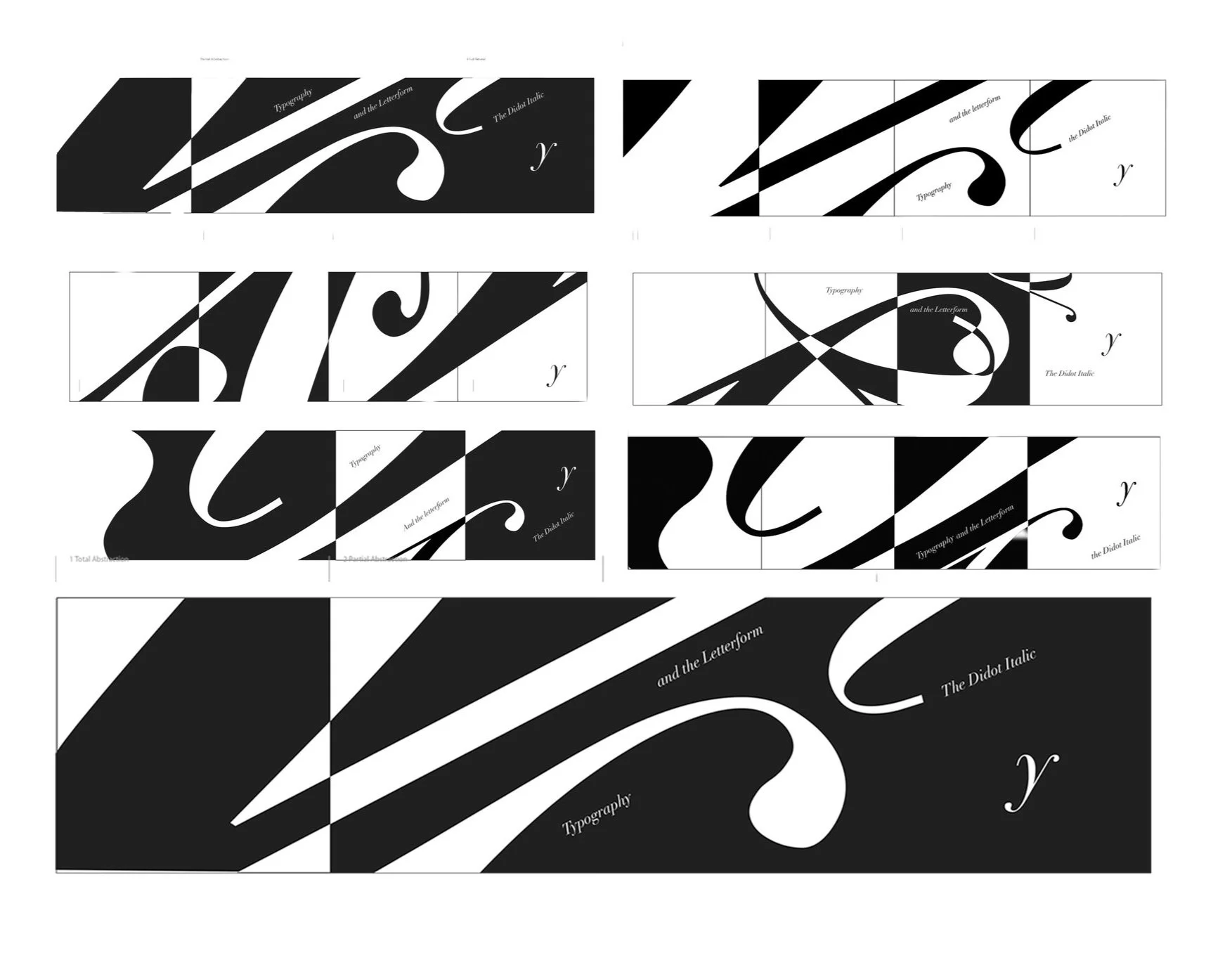
Creating a composition in which each quadrant shows more of the letterform and what makes it typographically unique.
Typographic letterform
Type Play
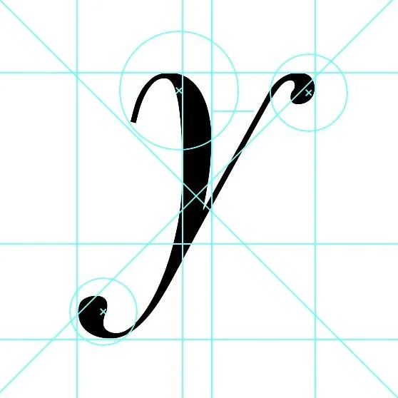
By choosing a letter that is different in many font styles I could experiment with numerous different type faces. Galliard, Sarifa, and Didot all explore the beauty and form of the letter Y in different ways. The Didot letter form Y has extreme contrast and thin spacing between lines, making it unique.
Sketching
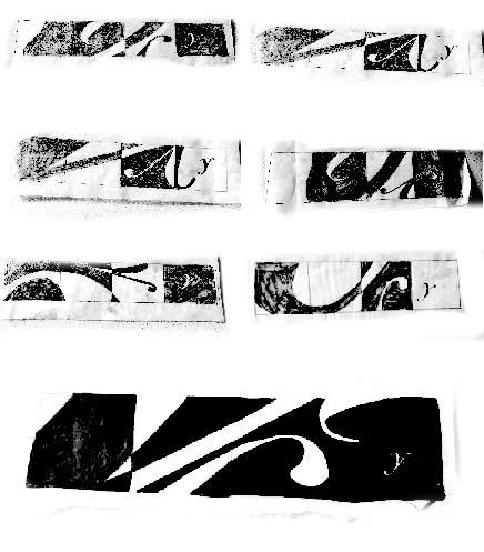
On tracing paper I placed a printed out version of the letterform in different type sizes to create a dynamic composition which revealed the form. I went on to cut up fabric and copying each sketch onto it. The organic shape of the fabric helped me see how the letterform would appear on a flexible surface.
Digital Iterations
Transferring each sketch into illustrator. Added the words “typography and the letterform the Didot Italic Y” to transform the composition into a story unfolding.
Final


